
A weak solar yield model can miss revenue by hundreds of thousands of dollars per year. If I’m modeling U.S. solar output, I’d use five data sources together: satellite/reanalysis data for the starting weather picture, on-site sensors for site truth, SCADA for plant output, inverter/string data for fault checks, and asset history for loss context.
Here’s the short version:
- Satellite and reanalysis data help with long-term energy estimates and early-stage screening.
- On-site weather sensors help correct weather bias at the plant.
- SCADA data shows what the plant produced and when.
- Inverter and string-level data helps find unit-level problems.
- Asset and maintenance records explain downtime, repeat failures, and long-term drift.
A few numbers show why this matters:
- A 2% to 3% annual forecast error on a 100 MW portfolio under a $0.05/kWh PPA can shift yearly revenue by a large amount.
- U.S. utility-scale and C&I systems in one study underperformed modeled financing expectations by 6.3%.
- Remote irradiance data can carry 3% to 5% error before plant-level correction.
- In one NREL dataset, only 41% of 19,460 inverters passed data quality checks.
If I had to boil the whole article down to one point, it would be this: no single data source is enough. You need a stack that matches the job, whether that job is bankability, monthly revenue forecasting, curtailment tracking, or fault diagnosis.
What to compare across each source:
- Coverage
- Latency and resolution
- Error risk
- Fit for forecasting
Quick Comparison
| Data source | Main use | Main issue | Best fit |
|---|---|---|---|
| Satellite / reanalysis weather | Long-range resource baseline | Site bias, coarse grids in some cases | Development, diligence, portfolio studies |
| On-site sensors | Plant-level weather truth | Soiling, drift, bad placement | Bias correction, PR work, contract support |
| SCADA | Plant output and status | Mapping, unit, and timestamp errors | Production tracking, curtailment, back-testing |
| Inverter / string data | Component fault diagnosis | Vendor field mismatch, missing data | Failure analysis, degradation checks |
| Asset / maintenance records | Downtime and lifecycle context | Incomplete logs, disconnected systems | Availability, repeat failure risk, long-range loss assumptions |
So if you’re asking, “What are the best data sources for solar yield models?” my answer is simple: start with remote weather data, correct it with site sensors, track plant output with SCADA, use inverter data to explain equipment loss, and use solar business management software to track maintenance records and explain what changed over time. That stack gives you the clearest path to cleaner forecasts and fewer surprises.
1. Satellite and Reanalysis Weather Data
Satellite and reanalysis data give solar yield models their broadest starting point: wide coverage, long history, and no site hardware required. That makes them a strong fit for early-stage development, M&A diligence, and portfolio screening when on-site sensors still aren’t in place. The tradeoff is pretty simple: they score high on coverage, but lower on site-level precision and live-use value.
Coverage
NSRDB (National Solar Radiation Database) is a common historical baseline for U.S. solar portfolios. Its historical product covers 1998 to present at 4 km x 4 km and 30-minute resolution [4]. Newer products provide 2 km, 5-minute data for the continental U.S., Hawaii, Mexico, and the Caribbean Islands, plus 2 km, 10-minute data for North and South America [4]. It includes GHI, DNI, and DHI, and its historical series are serially complete, which helps cut down gaps during model training [2].
ERA5 is a global reanalysis product covering 1940 to present at hourly intervals on a 0.25° x 0.25° grid. You get long, global coverage, but you give up some site-level detail. That makes ERA5 a good option when comparing assets across several countries or setting one standard baseline for long-range analysis.
Solcast and SolarAnywhere are commercial services built for solar forecasting. Solcast offers spatial resolution down to 90 meters, with temporal outputs from 5 to 60 minutes and forecast updates every 5 to 15 minutes [10]. SolarAnywhere offers spatial resolution down to 1 km and temporal resolution as fine as 1 minute.
Latency and Resolution
Latency decides where each dataset fits.
ERA5 and NSRDB are built for historical reconstruction, not live operations. NSRDB has about a 1-year lag on its historical products [4]. ERA5 is also geared toward looking backward. So if you’re handling intraday dispatch or battery scheduling, these aren’t the tools for the job.
Solcast and SolarAnywhere are aimed at operations. Solcast refreshes forecasts every 5 to 15 minutes and covers a window from 7 days back to 14 days ahead [10]. SolarAnywhere’s short-horizon products use cloud-motion-vector methods and refresh as new satellite imagery comes in, with forecast ranges from 1 minute to 5 hours ahead. For day-ahead and intraday decisions, these commercial feeds are the practical pick.
Error Risk
No satellite or reanalysis dataset is free of bias. Common error sources include cloud misclassification, terrain shading, snow cover, aerosols, humidity, and local weather patterns that coarse grids just can’t fully see. ERA5’s global mean irradiance bias has been reduced by 50% to 75% compared with earlier reanalyses, but it still smooths out site-level swings in complex terrain. Satellite-derived products often beat reanalysis for many solar use cases, but they can still miss fast-moving cloud edges and changing atmospheric conditions.
Here’s the key distinction:
- Random error can often be reduced through blending and calibration.
- Systematic bias needs local observations to correct.
A benchmark against 57 BSRN stations found measurable bias in all 10 datasets, which is a strong reminder that ground-truth calibration still matters [12].
Fit for Business Forecasting
| Dataset | Best Use Case | Limitation |
|---|---|---|
| NSRDB | U.S. resource assessment, historical benchmarking, bankability | About a 1-year historical lag; newer high-resolution products are regionally limited |
| ERA5 | Global benchmarking, long climate baselines, multi-country portfolios | Coarser grid; less precise in terrain-sensitive or localized sites |
| Solcast | Operational forecasting, dispatch optimization, intraday scheduling | Less suited to deep-history climatology than archive datasets |
| SolarAnywhere | Short-horizon forecasting, fast-refresh operational workflows | Product specifics vary by version and region |
Use NSRDB or ERA5 for historical resource assessment, then validate with on-site sensors before using satellite data for bankable forecasting. For site-level calibration, compare these baselines with on-site weather stations and irradiance sensors.
2. On-Site Weather Stations and Irradiance Sensors
Once you have broad weather baselines, on-site sensors bring the model back to what’s happening at the plant. Satellite data gives you coverage across a big area. On-site instruments give you plant-level ground truth.
Coverage
The main tools here are thermopile pyranometers and PV reference cells. Pyranometers measure GHI and POA in W/m². Reference cells track module response more closely, which makes them useful for POA monitoring and performance ratio work.
The catch is coverage. In many plants, a single GHI sensor and a single POA sensor may stand in for a large array. That means differences in tilt, azimuth, and shading can slip through the cracks. Sensor placement matters too. If a unit sits near inverter skids or other obstructions, the readings can pick up bias.
Latency and Resolution
This is where on-site sensors have a clear edge over satellite products. A well-set-up MET station can sample irradiance every 1 to 5 seconds and log averaged values every 1 to 5 minutes, with data reaching the SCADA system within seconds to a few minutes [1].
That’s much faster than the 15- to 60-minute intervals common with satellite feeds. And that speed matters. It can catch ramp events, inverter clipping, and short cloud-driven swings that lower-frequency data would blur.
Error Risk
Most errors from on-site sensors come from installation and upkeep.
Soiling on pyranometer domes or reference cell surfaces can lower measured irradiance. Best-practice guidance says cleaning should happen often enough to keep degradation below 1% to 2% [14].
Misalignment is another common problem. GHI pyranometers need to be mounted perfectly level. Even small tilt errors can create cosine response bias. Reference cells bring their own issue set, mainly spectral and temperature sensitivity, so temperature correction helps line them up more closely with module behavior.
Calibration drift is slower, but it can do real damage. High-grade pyranometers should be recalibrated about every two years. One study that tracked 23 pyranometers found a dramatic improvement in RMSE after calibration [15]. That’s a strong reminder that uncalibrated sensors can skew yield-model inputs in a big way.
Fit for Business Forecasting
On-site sensors work best as a localization and validation layer, not as a standalone forecasting source. For short-term forecasting, from minutes to a few hours, high-frequency site data can support nowcasting. For day-ahead and longer horizons, it helps bias weather inputs.
It also helps tie irradiance data back to plant performance and reporting. Blu Banyan‘s SolarSuccess can centralize MET station data alongside performance monitoring and financial reporting.
| Instrument | Strengths | Key Error Risks | Best Fit |
|---|---|---|---|
| Class A Pyranometer | Standardized irradiance measurement for GHI and POA | Soiling, leveling errors, calibration drift | Utility-scale forecasting, compliance, PR monitoring |
| PV Reference Cell | Matches module spectral and angular response | Spectral mismatch, temperature sensitivity | POA monitoring, performance diagnostics |
| Full MET Station | Captures ambient temperature, wind, module temperature, and irradiance | Siting errors, data-mapping errors | Plant-level operations and anomaly detection |
SCADA then turns these point measurements into plant-wide operating data.
3. SCADA System Data
SCADA takes site sensor data and turns it into plant-wide telemetry. A MET station gives you irradiance and temperature at one fixed spot. SCADA goes much further. It pulls data from inverters, combiner boxes, power meters, tracker controllers, and weather stations into one plant-level view.
That’s why SCADA is the main operating record for yield modeling. It’s the layer that turns weather and sensor inputs into outage data, curtailment data, and benchmark data. Put simply, SCADA sits between weather inputs and equipment-level diagnostics.
Coverage
In a utility-scale U.S. plant, SCADA often tracks hundreds to thousands of tags. These usually include active power, reactive power, AC voltage, equipment status, fault codes, curtailment signals, and site readings.
That broad view helps you see more than total energy production. You can also see why output looks the way it does. Is a unit faulted? Curtailed? Running as expected? SCADA helps answer that.
Coverage quality depends a lot on commissioning. Smaller commercial sites sometimes have only part of the full setup. They may skip string-level data or secondary sensors. And some tags that matter for modeling – like module back-of-panel temperature or detailed tracker status – may not be wired in at all.
Latency and Resolution
SCADA screens usually refresh every 1 to 5 seconds. Historians usually store data at 1- to 5-minute intervals, while API or integration lag often falls between 15 and 60 minutes [1].
That level of detail is usually enough for day-ahead forecasting.
Error Risk
This is the part where SCADA demands care. Common issues in U.S. solar plants include point mapping errors, communications gaps, scaling mistakes, and timestamp misalignment.
Point mapping errors can be especially hard to spot. On multi-vendor sites using Modbus, DNP3, or IEC 61850, a bad register map can assign one inverter’s data to the wrong unit or report power in MW when the model expects kW. Wrong point mapping or bad data typing can also assign one inverter’s data to the wrong unit.
Another problem shows up when a field device drops offline. Some SCADA historians keep the last value instead of recording a gap. On paper, that can make an offline inverter look like it’s still running. If you train a model on that history, the model gets the wrong story.
The table below separates data issues you can fix from actual production losses.
| Error Type | What Goes Wrong | Fix |
|---|---|---|
| Point mapping errors | Wrong inverter data attributed to wrong unit; kW vs. kVA confusion | Validate point lists against single-line diagrams at commissioning |
| Scaling mistakes | Power logged in MW interpreted as kW; irradiance units mixed | Confirm units against device ratings at commissioning |
| Timestamp drift | SCADA and satellite data misaligned; models train on wrong slices | Sync all devices to NTP; preserve device-side timestamps |
Fit for Business Forecasting
SCADA is the core operating layer for yield modeling. But on its own, it’s not enough. It still needs weather inputs and equipment records to sort outages, curtailment, and actual performance losses.
When teams fix those gaps, the results can be hard to ignore. A U.S. independent power producer standardized tag names and units across 20+ plants, then reprocessed three years of SCADA history. That work narrowed its fleet-wide P50 forecast error from roughly 6% to 8% down to 3% to 4% relative to actuals, mainly by classifying curtailment and outage periods the right way [1].
Platforms like Blu Banyan’s SolarSuccess can help bring SCADA data together with asset records and financial reporting. For operators with a spread-out portfolio, that makes it easier to keep data pipelines consistent across sites.
Inverter logs and string-level data can catch faults that plant-wide SCADA may miss.
4. Inverter Logs and String-Level Data
SCADA tells you what the plant did. Inverter logs and string-level data help you see why it happened at the component level.
Inverter logs usually include AC output power, DC voltage and current for each MPPT input, internal temperatures, fault codes, and status signals. String-level monitoring goes one step further by recording current for each string, and sometimes voltage too. That extra detail matters. It lets you spot one weak string instead of chasing a vague array-wide problem. In short, this data is best for diagnosing loss, not for estimating weather.
Coverage
Older or smaller inverters often give you only rolled-up DC and AC values, with no per-string detail. At utility-scale sites with string monitoring hardware, operators can track each string and catch local issues such as soiling, shading, MC4 connector corrosion, or bypass diode failures by comparing parallel strings under the same irradiance conditions.
Inverter logs offer almost nothing on site conditions. There’s no irradiance reading, no ambient temperature, and no wind speed. So if you want to model yield, you need to pair inverter data with weather inputs.
That said, coverage only helps if the data is clean enough to compare across strings and inverters.
Latency and Resolution
Inverter data usually comes through an API or SCADA system at a 1- to 15-minute cadence. Some high-end setups support sub-minute sampling for diagnostic campaigns, but for long-range forecasting, 5- to 15-minute data is usually enough.
What matters more is completeness. A dense feed full of holes won’t help much. Prioritize availability instead: 99%+ is strong, while anything below 95% is weak [1].
Error Risk
The biggest data-quality problems tend to show up in mixed fleets. A large NREL study covering 19,460 inverters found that only 41% passed data quality checks. The rest had problems such as data shifts (22%), missing data (5%), inconclusive orientation data (4%), and excessive clipping (2%) [1].
Vendor inconsistency makes this messier. Different manufacturers often use different field names for the same variable. For example, “Pac” and “ActivePower” can refer to the same thing. If your pipeline doesn’t account for that, it can misread the data. Firmware updates can cause trouble too. They may change which fields are available or shift scaling factors in the middle of deployment, which breaks historical time series.
This source becomes useful only after you normalize field names, units, and timestamps. The usual fix is a normalization layer that maps vendor-specific fields into one shared schema and tracks device metadata such as firmware version and communication protocol.
Those patterns get a lot more useful when you line them up with maintenance history.
Fit for Business Forecasting
Inverter logs and string-level data matter most for fault analysis, degradation tracking, and predictive maintenance. They’re not a standalone forecasting input. They work better as a diagnostic layer that explains why output drifts from expectations.
That matters because inverters account for 30% to 40% of all solar downtime, and telemetry can flag developing issues 7 to 14 days before total failure [1].
For degradation tracking, multi-year inverter and string datasets let you calculate performance ratios at the inverter or string level, then study those trends over time. That helps separate actual decline from normal seasonal swings. String-level trends can also reveal module aging or new shading long before plant-level data picks it up.
Use these signals to flag component-level loss, then confirm the root cause with asset records and maintenance history.
5. Asset Records and Maintenance History
Component-level fault data only helps forecasting when it’s tied back to the asset’s history. Asset records and maintenance history are static compared with telemetry, but they fill in things telemetry can’t show: how the plant was built, what changed over time, and how equipment has actually performed in service.
That means tracking equipment inventories, as-built string maps, commissioning reports, warranty documents, performance tests, and work orders. For each work order, capture the date, component, failure mode, root cause, parts replaced, downtime, and resolution. Without that context, service history is just a pile of records. With it, it becomes forecast input.
Coverage
Good coverage starts with full asset registration, a continuous work-order record, and logged outages or derates from commissioning through today. Include maintenance, repairs, updates, contracts, warranties, and external events such as grid outages and curtailment [18].
If those outside events are left out, production losses can get pinned on equipment issues by mistake. And once that happens, the forecast starts leaning in the wrong direction.
Latency and Resolution
Asset records move slowly on purpose. Static data, such as equipment models and nameplate capacity, usually changes only when a project is built, repowered, or reconfigured. So the lag is often measured in months or years.
Maintenance history updates more often, usually with each work order, often within a day or two after closure. Even so, it still reflects discrete events, not a continuous time series.
In practice, asset and maintenance data shape assumptions around degradation, availability, and repeat failures for medium- and long-range forecasts. SCADA and inverter logs deal with short-term swings. One handles the background story; the other handles the moment-by-moment signal. They work together, not against each other.
Error Risk
The biggest problems are inconsistent data entry and disconnected systems.
When technicians log work orders in different ways – skipping failure codes, using different names for the same part, or leaving downtime blank – the data gets messy fast. It becomes hard to group repeat issues or compare results across sites.
Disconnected systems make that worse. If asset registers, field service tickets, and financial records sit in separate tools that don’t talk to each other, analysts end up spending more time matching records than using them.
Use these records to separate actual production loss from planned work, grid events, and repowering changes. Common failure modes look like this:
| Error Type | Effect on Forecasting | Fix |
|---|---|---|
| Missing or inconsistent failure codes | Cannot cluster recurring faults or identify high-risk asset classes | Enforce controlled vocabularies in work-order templates |
| Unlogged minor outages | Availability is overstated; forecasts are too optimistic | Integrate SCADA alarms with maintenance ticketing |
| Outdated equipment records after repowering | Models assume the wrong capacity or efficiency curves | Trigger asset record updates as part of the repowering workflow |
| No serial numbers on replaced components | Traceability gaps for compliance and warranties | Require serial capture as a mandatory work-order field |
Fit for Business Forecasting
Asset records and maintenance history support three forecast inputs that other sources can’t reliably supply: degradation rates, availability factors, and recurring failure risk.
Equipment specs and commissioning test results set the starting performance baseline. After that, long-term maintenance patterns – PID events, backsheet cracking, tracker wear – help shape site-level degradation rates instead of relying on generic assumptions. Historical downtime logs, broken out by failure class, then feed straight into annual availability calculations.
Blu Banyan’s SolarSuccess ERP puts asset registers, project records, work orders, inventory, and financials into one system [16][17]. When asset records are structured well, forecast assumptions are easier to trace and easier to audit. At that point, asset history stops being just admin paperwork and starts serving as part of the forecasting stack.
Pros and Cons of Each Data Source for Forecasting
No single source handles every forecasting job. Each one covers a different layer of the picture. Start with broad weather inputs, move to site sensors, then look at plant and lifecycle records. Remote weather data sets the baseline. Site sensors tune that baseline. Operational data helps explain where the gaps come from.
| Data Source | Major Advantages | Major Disadvantages | Best-Fit Forecasting Use Case |
|---|---|---|---|
| Satellite / Reanalysis Weather Data | Wide geographic coverage; long historical record; low-cost; no site hardware | Lower spatial resolution; can miss local terrain effects; needs bias correction for site-level accuracy | Portfolio screening, bankability studies, long-range production estimates, sites without instrumentation |
| On-Site Weather Stations & Irradiance Sensors | Captures site-specific conditions remote data cannot resolve; high-frequency sampling | High upfront cost and maintenance burden; calibration drift; data gaps if poorly maintained | Lender-grade yield validation, PPA compliance, local calibration of remote weather products |
| SCADA System Data | High-frequency telemetry; strong for anomaly detection | Does not isolate weather-driven variance; requires very high data completeness to support predictive models | Real-time operations, performance ratio tracking, curtailment detection, forecast back-testing |
| Inverter Logs & String-Level Data | Granular fault detection; early warning for inverter issues; captures string mismatches | Vendor-specific formats; data can be noisy; limited value for broad weather-driven forecasting on its own | Predictive maintenance, root-cause analysis, degradation tracking |
| Asset Records & Maintenance History | Supports degradation and availability modeling; explains long-term yield divergence | Static and slow to update; often unstructured or incomplete; not a real-time input | Loss attribution, explanatory modeling, post-event performance analysis, long-term lifecycle planning |
The best source depends on the job at hand. If the goal is planning, remote weather data and site sensors do most of the heavy lifting. If the goal is day-to-day plant oversight, SCADA and inverter data matter more. And if you’re trying to figure out why modeled yield and actual yield drift apart over months or years, asset records and maintenance history start to do the talking.
Put simply:
- SCADA and inverter data push forecasting toward operations.
- Asset records sit on the explanatory side of the stack. They move more slowly, but they matter when you need to understand long-term yield divergence.
Conclusion and Recommended Data Stack
No single source can do the whole job. The strongest yield models combine weather, sensor, operational, and asset data so teams can balance forecast accuracy, speed, and explainability. The right mix comes down to coverage, latency, error risk, and forecast horizon.
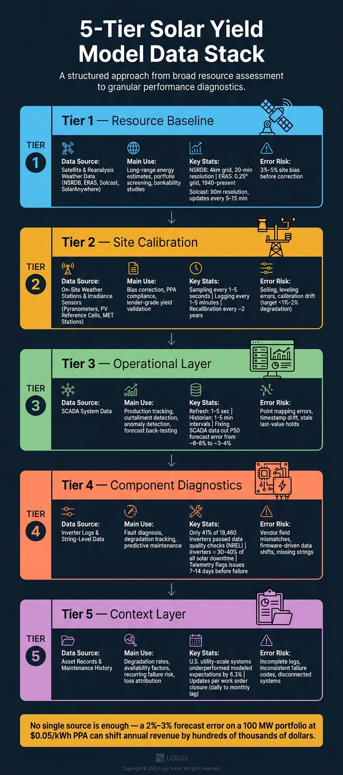
A better way to look at it is this: the stack isn’t a group of replacements. It’s a sequence. Start with the baseline, add calibration, bring in operations, then layer on context. For U.S. solar companies, the practical move is to use a tiered stack:
- Tier 1 – Resource baseline: Satellite and reanalysis weather data
- Tier 2 – Site calibration: On-site sensors for validation and bias correction
- Tier 3 – Operational layer: SCADA and inverter logs for production tracking and anomaly detection
- Tier 4 – Context layer: Asset records and maintenance history to explain long-term divergence
That setup lines up well with the most common use cases:
| Business Goal | Recommended Data Sources | Why It Fits |
|---|---|---|
| Long-term yield estimation and bankability | Satellite/reanalysis + on-site irradiance sensors | Best mix of history and site truth |
| Performance guarantees and contractual reporting | On-site sensors + SCADA availability metrics + asset records | Defensible irradiance and normalized production data |
| Short-term operational forecasting | SCADA + inverter logs + on-site sensors | High-frequency telemetry shows current plant status |
| Predictive maintenance and fault detection | SCADA + inverter/string-level logs + maintenance history | Helps isolate failure causes |
| Portfolio risk management | Satellite/reanalysis + SCADA + asset records | Broad coverage helps flag higher-variability or higher-risk sites |
| Financial reporting and revenue planning | SCADA production data + asset records + ERP financial records | Connects production data to finance |
When these data sets sit in different systems, achieving project management excellence through system integration becomes the last piece of the puzzle. Blu Banyan’s SolarSuccess can connect SCADA, work orders, inventory, and financial records in one system, while keeping asset and maintenance history structured for forecasting and reporting.
FAQs
Which data source should I prioritize first?
Start with solar irradiance, insolation, and solar spectrum data in your ERP to set a reliable performance baseline. That gives you a clean way to tell the difference between output swings caused by weather and drops caused by equipment trouble.
For operations and predictive maintenance, put inverter data first. Inverters account for 30% to 40% of solar downtime, and they generate detailed fault logs that can point to trouble early. After that, bring in device telemetry, revenue-grade meters, and asset master data.
How often should solar yield model inputs be updated?
It depends on the data type and the role it plays in day-to-day operations.
For live monitoring and grid management, SCADA and sensor data are usually logged every 1 to 5 minutes. In high-availability setups, polling often happens every 5 to 15 seconds.
Financial and project inputs should update automatically as milestones happen. And if you’re building baseline performance models, you’ll usually need 6 to 12 months of clean historical data to work from.
For reporting, daily or monthly updates should be automated so teams have steady, consistent visibility.
What causes the biggest errors in solar yield models?
The biggest errors usually start with inconsistent or low-quality data inputs. And that’s a problem, because bad data can mask actual equipment issues.
Some of the most common causes are telemetry loss, faulty sensor signals such as incorrect Modbus mapping or negative irradiance readings, disconnected systems that prevent accurate reconciliation, and mismatched data formats for dates, units, or currency.
Without automated validation, these problems can ripple across dashboards. Once that happens, it gets much harder to tell whether a drop in performance came from the weather or from a technical fault.
