Want to reduce solar project defects and improve efficiency? Building a defect dashboard in your ERP system is the solution. Here’s how you can create one in five steps:
- Set Quality Goals and Metrics: Define clear objectives and track key metrics like First Pass Yield (FPY) and Cost of Poor Quality (COPQ).
- Organize and Clean Data: Standardize defect data fields and ensure accurate entry for reliable insights.
- Design Dashboard Layouts: Create tailored views for different roles (e.g., operators, supervisors, executives) with intuitive visuals.
- Configure ERP Tools: Use saved searches, filters, and alerts to automate defect tracking and notifications.
- Validate and Refine: Test the dashboard, gather feedback, and adjust to meet team needs effectively.
Why it matters: Defect dashboards centralize quality data, reduce errors, and provide real-time insights, helping solar companies cut costs and improve project outcomes.
Learn how to implement these steps and streamline your operations with an ERP system a powerful tool for managing solar installation quality.
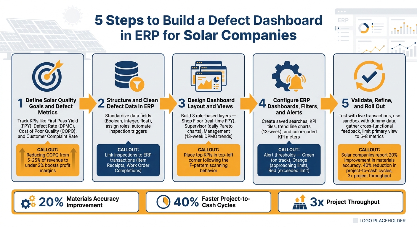
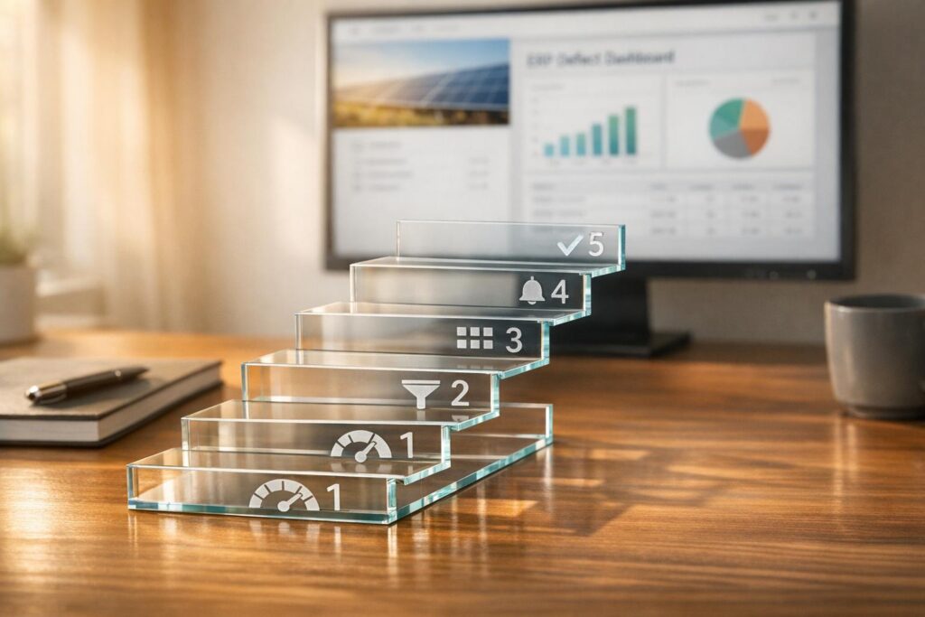
5 Steps to Build a Defect Dashboard in ERP for Solar Companies
Step 1: Define Solar Quality Goals and Defect Metrics
Aligning Dashboard Goals with Business Needs
Before diving into reports or charts, it’s crucial to pinpoint the problem you’re solving. A dashboard without clear objectives is just a collection of numbers. To manage quality effectively, shift from reactive fixes to strategies that prevent issues from happening in the first place.
One way to connect quality issues with business outcomes is by translating them into the Cost of Poor Quality (COPQ). For instance, lowering COPQ from 5–25% of revenue to under 2% can significantly boost profit margins for a $20M solar business.
Once your goals are solidified, focus on metrics that directly reflect operational and financial performance.
Selecting Key Defect Metrics
Choosing the right key performance indicators (KPIs) is essential. They should highlight both day-to-day operations and their financial impact. For solar companies, these metrics can be tracked in your ERP system:
| Metric | What It Measures | Solar-Specific Application |
|---|---|---|
| First Pass Yield (FPY) | Percentage of installations completed without rework | Track by crew, site type, or panel model |
| Defect Rate (DPMO) | Defects per million opportunities | Standardizes quality performance across installation types |
| Cost of Poor Quality (COPQ) | Financial impact of internal and external failures | Link to specific job numbers or project phases |
| Customer Complaint Rate | Complaints per 1,000 completed projects | Tracks if internal fixes are effectively solving issues |
FPY, for example, provides a clear picture of how efficiently installations are completed without needing rework. In industries with complex processes, world-class FPY typically exceeds 95%, while simpler tasks aim for 99% or higher. Solar companies can normalize this metric by tracking FPY per megawatt (MW) installed, which accounts for variations in project size.
Documenting KPI Definitions and Thresholds
For proactive quality management, consistent KPI documentation is non-negotiable. Inconsistent definitions – like one team counting a re-inspection as a defect while another does not – can undermine the accuracy of dashboards. For each KPI, make sure to include:
- The reason it matters
- Ownership (who is responsible for it)
- The calculation method
- What defines success
Setting thresholds for each KPI – such as baseline, target, and trigger points for yellow (at-risk) and red (failing) statuses – ensures your ERP system can automatically notify the right people when performance slips. This approach also helps balance leading indicators, like Process Capability (Cpk) (which predicts future defects), with lagging indicators, like customer complaints that reveal past issues.
sbb-itb-2560759
Step 2: Structure and Clean Defect Data in ERP
Standardizing Defect Data Fields
Once your KPIs are set, the next step is to make sure the data feeding into those metrics is consistent and well-organized. Even the most sophisticated dashboards can’t deliver reliable insights if the underlying data isn’t standardized.
Start by assigning the correct data type to each field. For example:
- Use Boolean fields (pass/fail) for binary checks.
- Use integers for defect counts.
- Use floats for measurements like voltage output or cell efficiency percentages.
This setup ensures your ERP system can calculate and summarize results accurately. Separate qualitative fields (e.g., visual inspections for glass scratches or discoloration) from quantitative ones (e.g., numeric measurements compared to control limits). This distinction is essential for maintaining accurate calculations.
Next, decide how your ERP will count defects. There are two primary methods:
| Counting Method | How It Works | Best For |
|---|---|---|
| All Categories | Counts every defect category in each sample. | Root cause analysis and tracking total defect density. |
| By Defect Severity | Records only the most severe defect per sample, using a hierarchy. | High-level quality reporting and quick pass/fail decisions. |
For solar quality dashboards, the "By Defect Severity" method is often preferred since it reduces unnecessary data noise and keeps the focus on the most critical issues.
Once your data structure is standardized, the next priority is ensuring the accuracy of the data being entered.
Ensuring Data Quality
After standardizing your fields, the challenge shifts to maintaining high data quality. Poor data entry can undermine even the best systems. To combat this, link inspections directly to ERP transactions like Item Receipts or Work Order Completions to trigger automated quality checks.
"Automated inspection workflows eliminate manual data entry and spreadsheet tracking, allowing quality engineers to focus on analysis rather than paperwork." – Anchor Group
Assign specific roles such as Quality Administrator, Engineer, or Manager to control who can enter or edit data. This creates a clear chain of custody for all quality-related information. Additionally, modern ERP and inventory management software like NetSuite (from the 2024.2 update) lock completed inspections to prevent edits. To handle corrections, establish a formal process for voiding and recreating records instead of overwriting them.
Integrating Related Data Sources
To enhance the insights on your dashboards, consider integrating external data sources with your ERP. For instance, linking defect records to field service tickets, inspection reports, or Return Merchandise Authorizations (RMAs) provides full traceability – from a customer complaint all the way back to the original installation lot or panel batch.
If your solar company uses IoT-enabled monitoring, real-time field measurements can also trigger defect alerts. These alerts can automatically flow into the same ERP workflows as manual inspection results. However, be cautious: ensure that the ERP’s specification context (e.g., Item, Vendor, Location, Transaction Type) perfectly matches the transaction. Mismatches are a common reason why automated data capture may fail to trigger.
Step 3: Design the Defect Dashboard Layout and Views
Tailoring Views for Each Role
Once you’ve standardized your defect data, the next step is creating a dashboard that caters to the specific needs of different users. A quality manager tracking weekly defect trends, for instance, will require different insights than a crew lead monitoring real-time performance on the shop floor. To address these varied needs, consider organizing the dashboard into three layers, each targeting a specific user role:
| Layer | Target User | Primary Focus |
|---|---|---|
| Shop Floor (Real-Time) | Operators / Crew Leads | Current shift FPY, active SPC charts, color-coded status alerts |
| Supervisor (Daily Summary) | Project Supervisors / Quality Managers | Pareto charts of top defect types, rework hours, daily FPY by crew |
| Management (Strategic) | Quality Directors / Executives | 13-week DPMO trends, COPQ as % of revenue, customer complaint rates |
Each user sees a view tailored to their role, pre-filtered to show only the most relevant data. With the roles defined, the next step is organizing these views into a layout that maximizes clarity and usability.
Structuring the Dashboard Layout
Start by placing the most critical KPIs – such as FPY and open defects – in the top-left corner. Research shows users naturally focus on this area first, following a scanning pattern shaped like the letter "F". Below the KPIs, include a trend chart that tracks metrics like DPMO or FPY over a rolling 13-week period. This helps supervisors and managers quickly gauge whether quality is improving or declining. Beneath the trend chart, add a Pareto chart to highlight defect types like panel microcracks, wiring faults, or mounting errors. This visual makes it easier to pinpoint and prioritize the issues causing the most rework.
To make the dashboard even more intuitive, use color-coded status alerts to highlight problems at a glance, removing the need to interpret raw data.
"First pass yield is the single most important quality metric because it captures the true quality performance of your process." – User Solutions
Using Drill-Down and Filtering Features
For deeper analysis, include drill-down and filtering capabilities in the dashboard. With drill-down paths, users can click on a high-level KPI to reveal more detailed data, such as breakdowns by project site, crew, or supplier. To maintain clarity, limit the hierarchy to 3–5 levels.
"The magic of drill-down capabilities is that they exist within a single report or dashboard. You don’t need to open multiple files or run separate queries. The context is maintained as you navigate through the data hierarchy." – Improvado
When implementing filters, ensure they are linked across all data sources on the dashboard. For example, selecting a specific crew should update all relevant charts and tables simultaneously. For static reports, like compliance summaries, use exclude filter settings to keep them unaffected by global selections. Finally, always include a "Reset" button so users can quickly return to the default view without manually clearing filters. These features ensure that users can access timely, actionable insights to support real-time decision-making.
Step 4: Configure ERP Dashboards, Filters, and Alerts
Now that your layout is ready and your data is structured, it’s time to bring your ERP dashboard to life. This step is all about turning your initial design into a functional tool your team can rely on daily.
Creating Saved Searches and Reports
Saved searches are the backbone of your dashboard. Every KPI tile, trend chart, or Pareto chart pulls its data from these searches.
Start by choosing the right search type – for defect tracking, this is often "Quality Inspection" or a similar transaction subtype. Then, apply filters to focus on the exact records you need. Use "And/Or" logic to refine your data further. For instance, you might filter by "Active" status to exclude closed inspections or by a specific date range to focus on the current quarter.
When building a search for a KPI tile, avoid adding date filters in the "Criteria" tab. Instead, move the date field to the "Available Filters" subtab. This allows the dashboard portlet to dynamically manage date ranges, making the same saved search work for both weekly and monthly views without needing separate configurations.
For defect counting, you can use one of these two methods:
| Counting Method | What It Counts | Best For |
|---|---|---|
| All Categories | Every critical, major, and minor defect | Tracking total defect density and audits |
| By Defect Severity | Only the most severe defect per sample | High-level risk assessment of critical issues |
To keep things organized, use clear and specific names for your searches. For example, "Quality – Monthly Inverter Defects" is much more helpful than a generic name like "Defect Search 3." Descriptive names make it easier for team members to understand and maintain the searches.
Once your saved searches are ready, focus on designing visuals that effectively communicate the data.
Designing Visual Components
Visual clarity is key. Your dashboard should present information in a way that users can grasp instantly.
"The human brain often processes visual information more quickly than text." – Austin Caldwell, Senior Product Marketing Manager, NetSuite
Use KPI tiles to highlight key metrics like First Pass Yield (FPY) or total open defects, offering a quick snapshot of operational health. For trends, set up a trend line chart covering at least 13 weeks. This helps identify patterns, such as seasonal increases in panel microcrack defects during high-demand months. For management-level insights, consider extending the trend to a full year to make seasonality more apparent.
One important detail: always clarify whether a metric represents a rate or a raw number.
"If you assume you are listing a rate, but it is a raw number, your users will be confused." – Austin Caldwell, Senior Product Marketing Manager, NetSuite
Stick to simple, flat visuals and avoid 3D charts, which can clutter the display without adding value. Focus on charts with one or two variables to ensure the insights are immediately clear.
Setting Up Alerts for Faster Issue Response
Once your visuals are in place, configure alerts to enable proactive management. Alerts ensure your team can respond quickly to potential issues. Most ERP systems allow you to link alerts to a specific saved search and set a priority level alongside a minimum alert count (e.g., at least 1) to determine when an item appears on the alert dashboard.
For visual alerts, use KPI meters with color-coded ranges to indicate status at a glance. Define thresholds where green means everything is on track, orange signals a potential issue, and red highlights a critical problem. If you leave a threshold blank, the meter will appear dimmed and won’t generate alerts – so always set these values explicitly.
| Status | Color | When It Triggers |
|---|---|---|
| Good | Green | KPI is within the acceptable range |
| Concerning | Orange | KPI is approaching the defined threshold |
| Attention Required | Red | KPI has exceeded the defined limit |
Daily thresholds automatically adjust based on the dashboard’s active time filter. For example, if your daily defect limit is set at 5, switching to a weekly view will scale it to 35. This saves you from manually recalculating thresholds for different timeframes. After configuring new alerts, refresh your dashboard or portlets to ensure the updates display correctly.
Using advanced ERP systems like Blu Banyan‘s SolarSuccess ERP can simplify these setups, offering real-time alerts and an efficient way to manage defects in your solar operations.
Step 5: Validate, Refine, and Roll Out the Dashboard
With your alerts and visuals in place, the next step is to finalize the dashboard. This involves testing its functionality, collecting feedback, and making adjustments to ensure it delivers actionable insights.
Validating Dashboard Metrics
Before rolling out the dashboard to your team, run a live test. For example, create a transaction such as a Work Order or Purchase Order, complete a quality inspection, and confirm that the metrics update in real time. This step helps identify and resolve setup issues early.
Double-check that the specification context – like Item, Vendor, Location, or Transaction Type – matches the filters applied to your dashboard. Consistency in how defects are counted is also critical. Whether you’re counting "All Categories" or breaking it down by "Defect Severity", ensure the same method is used across all saved searches. Mixing methods can lead to misleading totals.
To further test the dashboard, use a sandbox environment with dummy data. Focus on the 5–10 items with the highest defect rates or regulatory risks. This approach can help uncover data gaps without disrupting live operations.
Once the metrics are verified, gather feedback from users at all levels to refine the dashboard’s design and functionality.
Incorporating User Feedback
Think of the dashboard as a tool that evolves over time. After it goes live, schedule short, regular check-ins with representatives from quality assurance, operations, and management. These meetings provide a chance to evaluate how well the dashboard performs and identify areas for improvement. Cross-functional discussions often reveal issues that testing alone might miss. For instance, a filter that seems logical to one group may confuse another.
If certain sections of the dashboard are consistently ignored, it could mean those views don’t align with the users’ workflows. Adjust filters, thresholds, or layouts based on feedback, and clearly communicate these updates to ensure everyone stays aligned.
"Finding true defects is always challenging. It is vital to dig deeper during the defect management process. This avoids misinterpretations and assures that the software meets users’ needs." – Mykhailo Poliarush, CEO, Testomat.io
Using Dashboard Insights to Drive Improvements
Feedback and insights from the dashboard aren’t just for fine-tuning its functionality – they should also inform broader process improvements. For example, you might add Process Capability (Cpk) as a leading indicator alongside lagging metrics like scrap rate. A Cpk below 1.0 signals that a process is likely to produce defects, making early intervention essential.
Keep the dashboard focused. Limiting the primary view to 5–8 key metrics prevents information overload and makes updates easier as your quality objectives evolve. Use NetSuite for manufacturing tools like saved searches and custom workflows to make rapid updates when needed.
Conclusion: Building a Stronger Quality Management Process
Defect dashboards demand consistent effort to ensure better data quality, clearer insights, and quicker decision-making. Each step – whether it’s defining meaningful metrics, cleaning up data, designing intuitive layouts, automating alerts, or validating outcomes – contributes to creating a system that’s more effective and reliable. This methodical approach can lead to major operational improvements.
The results speak for themselves. Solar companies have reported a 20% improvement in materials accuracy, a 40% reduction in project-to-cash cycles, and even tripled project throughput. These outcomes highlight how integrated ERP systems are reshaping quality management for the better.
"We’re doing more with the same number of people and we have a system that’s more reliable and less stressful than tracking a million different spreadsheets." – Joe Marhamati, Co-Founder & VP, Ethical Energy
A unified ERP system acts as a single, dependable source for managing defects – from the moment they’re identified to their resolution. Tools like Blu Banyan’s SolarSuccess, which incorporate integrated dashboards, showcase how these systems can drive operational improvements. Whether you’re handling a few residential installations or scaling up a larger commercial portfolio, a well-designed defect dashboard equips your team with the clarity to respond swiftly and the insights to keep improving.
FAQs
Which defect KPIs should a solar company track first in an ERP?
When it comes to solar companies, keeping a close eye on specific metrics within an ERP system is crucial. Three key performance indicators (KPIs) stand out: project cost, schedule adherence, and overall system performance.
These metrics do more than just provide numbers – they help pinpoint inefficiencies and flag potential problems early on. By tracking these KPIs, solar companies can stay on top of project progress, manage costs effectively, and maintain system reliability. All of this plays a big role in ensuring smooth operations and keeping customers happy.
How do we standardize defect data so the dashboard stays accurate?
To keep your defect dashboard accurate and reliable, it’s crucial to prioritize consistent, high-quality data. Start by centralizing all defect data within your ERP system to create a single source of truth. Regularly clean and validate this data to eliminate inconsistencies or errors. Establish standardized data entry procedures to ensure uniformity across the board.
Additionally, adopting strong data hygiene practices – such as updating customer records and reconciling inventory with physical stock – can significantly reduce inaccuracies. These steps ensure your dashboard provides dependable, up-to-date insights, enabling smarter decision-making.
What alert thresholds should we set for FPY, DPMO, and COPQ?
- First Pass Yield (FPY): Strive for a level of 98%, ensuring the majority of units pass quality checks on the first attempt without needing rework. This reflects a strong production process.
- DPMO (Defects Per Million Opportunities): Set your sights on the lowest possible number, ideally keeping it under 1,000. This aligns with maintaining stringent quality standards.
- COPQ (Cost of Poor Quality): Concentrate on reducing measurable costs. For example, aim for a 25% reduction in costs after rolling out defect dashboards.